CURATOR
European specialty coffee ecommerce, committed to quality and sustainability, combining a modern and avant-garde image with an authentic and enriching coffee experience. The commitment to design attracts its niche market, coffee connoisseurs, and those who appreciate the art of artisanal micro roasters and coffee growers, supporting fair trade and reducing the carbon footprint. The business seeks to transform the coffee industry into a driver of positive change, from an aesthetic and ethical perspective.
Curador faced significant challenges on its platform. Limited payment methods and a restricted interface hampered the user experience and limited purchasing options. Additionally, the lack of a dedicated section for monthly subscriptions made it difficult to manage repeat customers.

-
Usability and interaction improvements
- Expanding payment methods to provide users with a more convenient and flexible shopping experience.
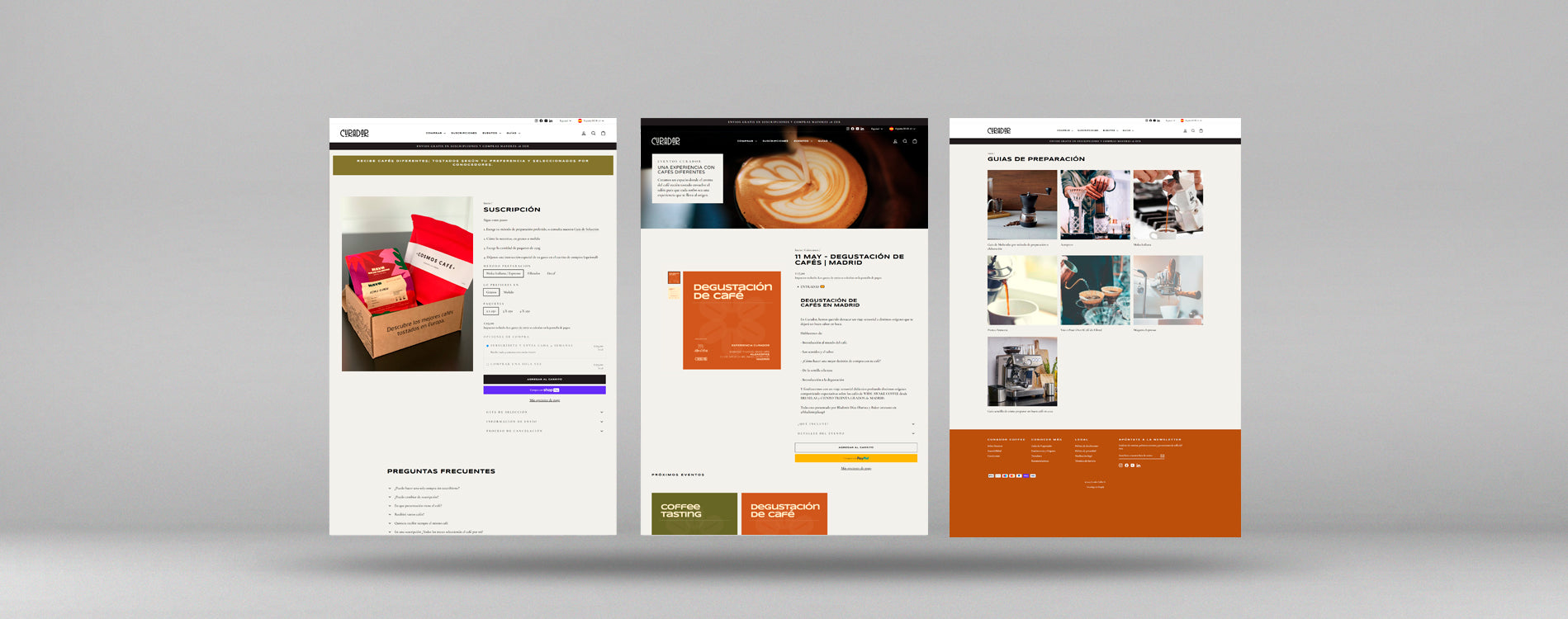
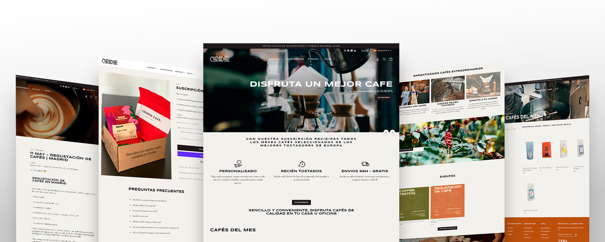
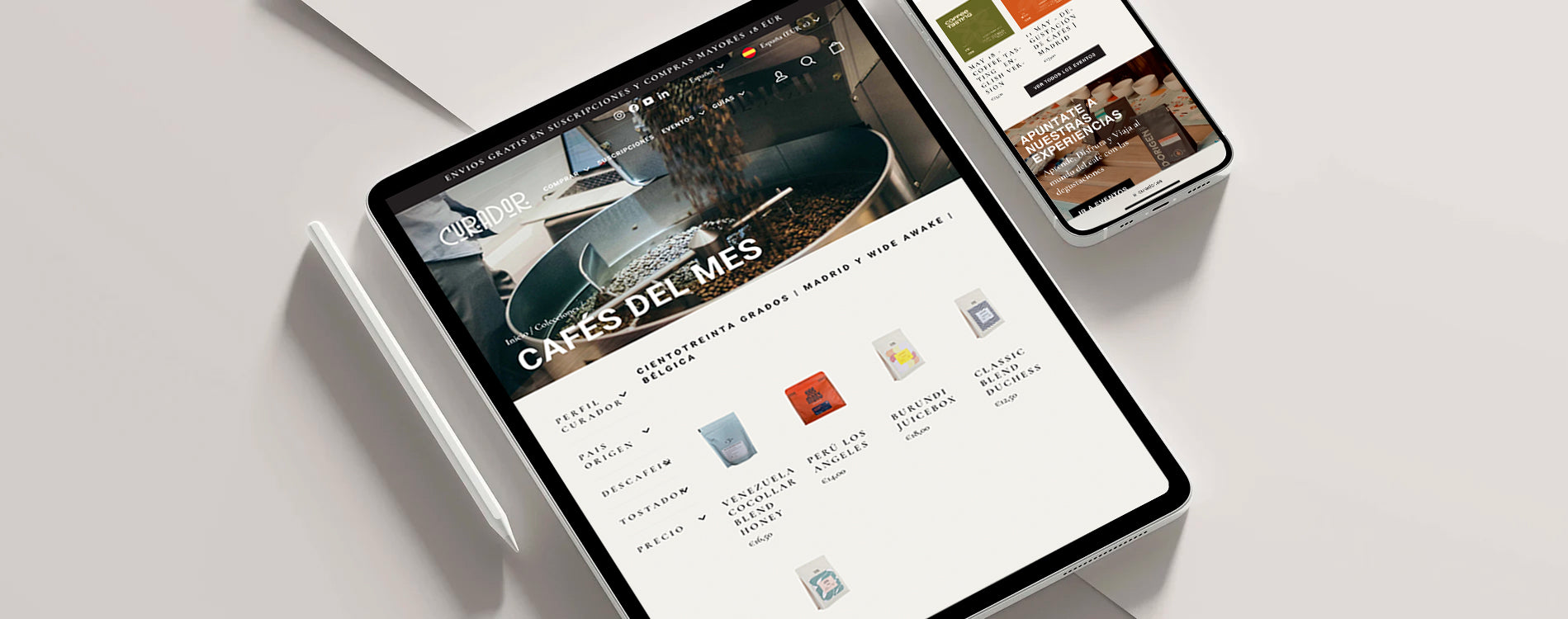
- Improved the user interface to make it more intuitive and easier to navigate, allowing users to quickly find what they are looking for and shop more efficiently.
- Creation of a specific section for monthly subscriptions , facilitating the management of recurring customers and promoting loyalty and repeat purchases.
- Optimized the navigation map to make it clearer and more consistent, helping users find relevant products and categories more quickly and easily.
-
Visibility and positioning improvements
- Search engine optimization (SEO) to improve page ranking in Google search results and other search engines. This includes optimizing relevant keywords, meta tags, and descriptions, as well as improving site loading speed and mobile friendliness.
- Improving existing content and creating quality specialty coffee-related guides , such as brewing guides, coffee basics, and information on origins and roaster profiles, with the goal of attracting an interested audience and improving the site’s authority and relevance in its niche market.
- Distribution of content on landing pages specific to each category, seeking to improve visibility in search engines and attract qualified and relevant traffic to the site.

The improvements implemented at Curador.es resulted in significant advances in several key areas. The expansion of payment methods allowed for a more versatile and convenient shopping experience for users, which resulted in a noticeable increase in transaction volume and greater customer satisfaction. In addition, the optimization of the user interface led to more intuitive and enjoyable navigation, which streamlined product searches and made it easier for users to complete their purchases more efficiently. These concrete changes were reflected in a measurable increase in both sales and customer satisfaction.


